In April 2023, I joined Silverbird as Senior UI Designer. My main task was creating a cohesive design system to align the customer onboarding system and the main web application. At that time, the company had also started looking into developing a native mobile app which would also need to be aligned to our standards, guidelines and brand.
Creating standards and guidelines was paramount to ensure consistency and efficiency. I collaborated with the team and performed an audit. I then crafted asset libraries for our design team and detailed specifications for developers, outlining everything from layout principles to interaction details. I also devised a comprehensive WCAG 2.1 compliant color system (dark theme included) and tokenized our design elements, streamlining the development process enabling us to keep the apps in sync and ensuring seamless integration with our brand identity going forward.


Outside of Figma, I identified a number of key improvements we could make to our front-end workflows and worked with stakeholders to develop a plan for implementing the system. We created a new project in code and connected to our new token system. We implemented Storybook as a component development environment and developer documentation site. Enabling everyone to view and QA our styles and components, test accessibility and visual regression .

I am very hands-on when it comes to development. I define, manage and review the work. I also spend time working closely with our developers, contributing to the system and documentation code myself.
I also documented the system using zeroheight. Allowing us to scale and to open the system up to departments outside of design and development. Enabling everyone to contribute to the core of our products. Zeroheight allows us to display both elements in Figma and previews of live components from storybook.

The culmination of these efforts was a cohesive design ecosystem that seamlessly extended across responsive web and native mobile platforms. By establishing clear standards and guidelines and leveraging a collaborative approach, we not only addressed the initial challenge but also laid a solid foundation for future iterations and expansion.
Simultaneously, as the company ventured into the realm of mobile development, I faced the exciting challenge of extending our design principles to the native mobile app. Drawing from our established standards, I led the UI design efforts, seamlessly translating the web experience into a mobile-friendly interface.
This involved not only adapting existing elements but also optimising the user flow and interface for a smaller screen sizes, touch interactions and improved accessibility.
We started with extensive competitor analysis and concept sketching.

We conducted qualitative research studies to identify how our existing web UX fell short on mobile - such as the need for a more seamless way to add beneficiaries while users were physically next to them. Based on these insights, we developed mobile design principles to guide our work.
Once we had a clear understanding of the mobile-specific needs, we began generating concepts - starting with rough wireframes and sketches to gather feedback. From there, we designed the information architecture for the mobile experience, addressing known structural issues from the web UX (e.g., requiring users to complete two separate flows before making a payment). This process aligned with our established mobile design principles and provided solutions tailored to the mobile-specific needs identified during discovery.

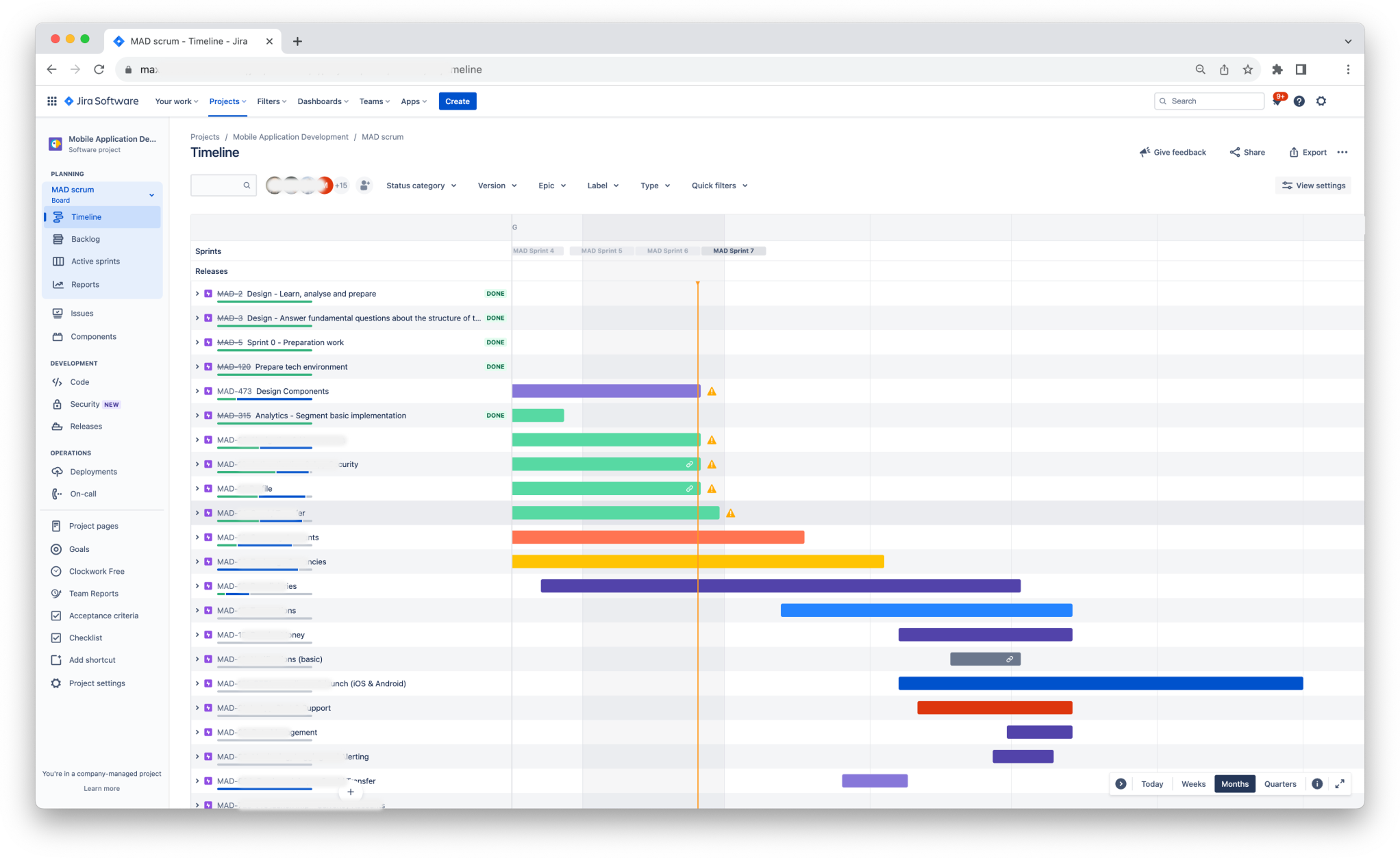
Collaborating with Product Management, we created a roadmap of epics and prioritized it based on the value of addressing user needs. Some features, like making payments, were essential for the first version, while others, such as exporting statements, could be deferred to v1.1.

From this roadmap, we started working on detailed designs, following our established design process. We then worked with the development squad to write, execute and QA user stories to build these designs.
I used advanced prototyping techniques in Figma to paint a clear vision for our developers and other stakeholders each step of the way. These prototypes were also extremely helpful for internal and external testing. The video below shows a prototype that was created using logical operators and binding variables to component variants in Figma.
Design of the Silverbird mobile app was a collaborative effort, involving close cross-functional coordination to ensure feasibility and alignment with technical constraints. Iterative prototyping and internal user testing played a crucial role in refining the design, allowing us to incorporate feedback rapidly.

